The narrative within this draft is a lot more stronger than the first draft. We also experimented with faster edits and using more slow-mo which, in my opinion, paid off.
Monday, 7 April 2014
Music video final draft
The narrative within this draft is a lot more stronger than the first draft. We also experimented with faster edits and using more slow-mo which, in my opinion, paid off.
Digipack final draft

My second draft in my opinion is much more successful than my first draft as it has more of cohesive design rather than looking messy on unfinished.
This draft also includes scenic photos which were inspired from my artwork research. I also still managed to include the conventions such as bar code, record label and small print.
I also included a distinction between the two discs by introducing the idea of a the-making-of DVD which becoming more popular in resent releases such as Lower Than Atlantis' 'Changing Tune' and You Me At Six's 'Cavalier Youth'.
Magazine advert final draft

Since I changed the album artwork, I changed the main image on my magazine advert. I feel this is a stronger advert as the vibrant colours draw your eyes to it unlike my first draft as it was boring in terms of colour.
I also included the information of the second disc which is a DVD as I did not do this on the last draft. I followed the same layout because I found, from my research, that this layout follows the conventions of most magazine adverts, especially in the pop-rock genre.
IN WHAT WAYS DOES YOU MEDIA PRODUCT USE, DEVELOP OR CHALLENGE FORMS AND CONVENTIONS OF REAL MEDIA PRODUCTS?
Via Youtube, i looked at many music videos from the pop-rock genre. The web 2.0 streaming website allowed me to access a wide range of different music videos from a wide range of bands. I looked at these videos to look for common conventions and genre specific conventions. From these videos, I created a Prezi of these different conventions which I would consider to use.
I also compared these conventions to conventions of both rap and metal videos showing that conventions are important to define a genre.
In terms of theory, Tessa Perkins says that there is sterotype attached to anything and it's there for a reason. The history of the rock genre and risse of pop music may have created the stereotype of that the narrative may be depressing. Although the theme of the song is about isolation, when the equilibrium is restored, there is a happy ending; showing we are breaking the old fashioned convention of rock videos.
Ancillary
When looking at the conventions of digipacks, I used the digipacks I actually owned. I did this because not only do I know them very well, but I can analyse in front of my eyes rather than over a screen. I discovered features such as the main image, barcode, text, spine and UPC code. I used powerpoint to analyse some of my favourite front covers.


As I did not have access to many magazines, I used web 2.0 in terms of Google images to find some magazine adverts. Using powerpoint again I analysed a few:


These allowed me to discover conventions and allowed me to create a template which I could recreate on Photoshop. The template allowed me to involve all conventions found which allowed me to use them effectively.

HOW EFFECTIVE IS THE COMBINATION OF YOUR MAIN PRODUCT AND ANCILLARY TEXT?
During the planning stage of the course, I used web 2.0 through the medium of websites such as Youtube and Google. I used these sites to watch music videos and to look at different examples of digipacks and magazine adverts to discover if there were similar features to create features. As my genre is something I know very well, I already know a lot of the bands involved within said genre. I was also able to access many digipacks and magazine adverts within the pop-rock genre as I already own both of these texts.
My foundation portfolio taught me how to easily identify conventions so I quickly found these and managed to find them within my genre, which can be seen in the first question of my evaluation.
One of the ways the three products work together is the title. As the song is called 'Black Cloud' I decided that album should be called this too. A lot of bands have started doing this such as Kids in Glass Houses - Peace, The 1975 - The 1975 and Decade - Good Luck; two of which include the album title track the first song on the album which inspired me to do the same. This would be effective when publishing the album as the audience will recognise the album due to hearing the promotional single; this is also the same for the magazine advert.
Also, within You Me At Six's 'Sinners Never Sleep' there was the use of a photo of the band. I included this as it will allow the audience, who have watched the promotional video, to recognise the band. I also used good looking actors/models as this will attract the young females within my demographic.

Another way was including the same album artwork on the promotional poster; as the artwork is quite scenic, the audience's eye will be drawn to it making the digipack work well with the poster. Although in a postmodern society, the artwork may be seen as 'style over substance' as it looks nice rather than conveying a message, thus making it empty. The artwork also works with both the mood of the song itself (isolation) and the mise-en-scene of the music video (suburban area).
I also used web 2.0 to access the website dafont.com where I could browse through different fonts. I used my pop-rock mood board to compare fonts that I though fit to the genre. After selecting the final font, I made sure I only used this font on both my digipack and magazine advert.


Between the digipack and magazine advert, I also made sure I used the same information such as the record label and the second disc (which was a DVD). This was made clear by identifying the conventions of both media products. So I made sure I included the Hopeless Records logo and made sure the poster clearly advertised the DVD that came with the album. I decided to use Hopeless Records as they are the biggest and most well known record label to have a mass amounts of pop-rock bands such as Neck Deep and The Wonder Years. This record label is also independent which may attract an audience who like to be into underground bands which not many people know. Although this would effect the promotion of the album as the label will not have enough money to create promotions such as television adverts like the labels within the 'big three' would.

I also used photoshop to see what my magazine advert would like in real life situations. I wanted to use both conventional and unconventional ways as the pop-rock genre is about breaking the rules but still appealing to a mass audience so most of the audience would not find the advert within a magazine.
To test the effectiveness of the products working together I interviewed Kiera, who featured within the video. I interviewed her as she meets my demographic and is attracted to good looking boys who are in a band.
My foundation portfolio taught me how to easily identify conventions so I quickly found these and managed to find them within my genre, which can be seen in the first question of my evaluation.
One of the ways the three products work together is the title. As the song is called 'Black Cloud' I decided that album should be called this too. A lot of bands have started doing this such as Kids in Glass Houses - Peace, The 1975 - The 1975 and Decade - Good Luck; two of which include the album title track the first song on the album which inspired me to do the same. This would be effective when publishing the album as the audience will recognise the album due to hearing the promotional single; this is also the same for the magazine advert.
Also, within You Me At Six's 'Sinners Never Sleep' there was the use of a photo of the band. I included this as it will allow the audience, who have watched the promotional video, to recognise the band. I also used good looking actors/models as this will attract the young females within my demographic.
Another way was including the same album artwork on the promotional poster; as the artwork is quite scenic, the audience's eye will be drawn to it making the digipack work well with the poster. Although in a postmodern society, the artwork may be seen as 'style over substance' as it looks nice rather than conveying a message, thus making it empty. The artwork also works with both the mood of the song itself (isolation) and the mise-en-scene of the music video (suburban area).
I also used web 2.0 to access the website dafont.com where I could browse through different fonts. I used my pop-rock mood board to compare fonts that I though fit to the genre. After selecting the final font, I made sure I only used this font on both my digipack and magazine advert.
Between the digipack and magazine advert, I also made sure I used the same information such as the record label and the second disc (which was a DVD). This was made clear by identifying the conventions of both media products. So I made sure I included the Hopeless Records logo and made sure the poster clearly advertised the DVD that came with the album. I decided to use Hopeless Records as they are the biggest and most well known record label to have a mass amounts of pop-rock bands such as Neck Deep and The Wonder Years. This record label is also independent which may attract an audience who like to be into underground bands which not many people know. Although this would effect the promotion of the album as the label will not have enough money to create promotions such as television adverts like the labels within the 'big three' would.
I also used photoshop to see what my magazine advert would like in real life situations. I wanted to use both conventional and unconventional ways as the pop-rock genre is about breaking the rules but still appealing to a mass audience so most of the audience would not find the advert within a magazine.
To test the effectiveness of the products working together I interviewed Kiera, who featured within the video. I interviewed her as she meets my demographic and is attracted to good looking boys who are in a band.
This interview allowed my to discover that my media products work together well and that they are very effective within my demographic.
HOW DID YOU USE NEW MEDIA TECHNOLOGIES IN THE CONSTRUCTION, RESEARCH, PLANNING AND EVALUATION STAGES?
Youtube
In terms of the area I am studying, Youtube is very effective for publishing music videos for both young bands with no connections to massive bands on major record labels. I learnt this from my own experience when I joined a band a long time ago and we decided to record a cover of a song we really like; even though it was terrible it gained about 1,000 views due to the amount of effort we put into spreading it around web 2.0 and social media. We also tagged this video as a response the original video making fans of the band come to watch our version. One thing I learned from this experience was the way a mass audience are totally honest, we quickly got lots of negative comments as both of us were rubbish at what we were doing back then. Because we received these comments we were able to asses ourselves until we got it right.
This was similar to the process in terms of creating our main media product. We would use Youtube to share test shots, storyboards and drafts. This allowed an audience of both teachers/students who are working on the course and a mass audience who can provide an unprofessional opinion. As our demographic mostly catered for unprofessional, young teenagers, we valued their opinion over opinions from our teachers who did not meet our demographic and had a professional eye to the media texts.
Youtube was also very effective when identifying conventions of both form and genre. As I am already a big fan of the pop-rock genre, I was already aware of bands which fit in this genre such as bands like Kids in Glass Houses, Mallory Knox and The Maine. But using Youtube to watch their music videos allowed me to discover further as the website uses a 'suggestions' section which introduced me to bands I have not heard of but who still fit in my genre. This allowed me to study further into the conventions making my results more valid and up to date.
Photoshop

Photoshop is a still image manipulation program which is used both professionally and unprofessionally. It is used to make from movie posters to editing spots out of your next Facebook profile picture. My Photoshop skills were clearly enhanced when making my product in my foundation portfolio. But I had never used the program to create a full digipack. Although I already had some experience making an A4 advert in my foundation portfolio.
Making the digipack required me to work in different sizes and different aspect ratios which I had never worked with before which made things very complicated when constructing the finished piece. As I used photos that already had filters on them, there was not a lot of messing with the photos to make them nicer; it was mostly making sure the text worked with the artwork making it both conventional and accessible. So I spent a lot of time on dafont.com finding the right font for my ancillary texts.
Overall, Photoshop was a very influential piece of technology due to its professional look and its easy to use workspace (when you have learned to use it).
Samsung MV900F
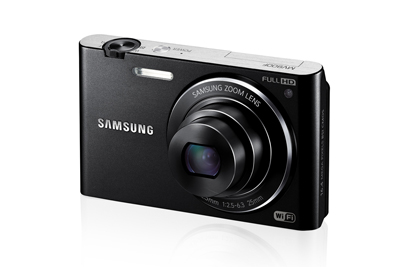
When shooting the moving image, we used a Samsung camera to film the actors. This was new territory for both me and Joe which resulted in some very bad test shots.
After a reviewing the footage we learned that we need a tripod to make sure the camera was focused and we learned our location was not suitable due its size and lighting. Out progress with the camera clearly progressed as we started experimenting with different camera framing and angles. These new shots did not match our story board as we realised the story board did not make sense.
iPhone 4s
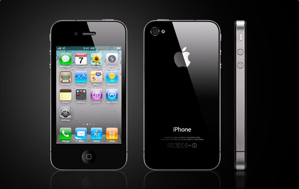
I used this more or less every day throughout the course. Through the proliferation and miniaturization of new media technologies, mobile phones are playing a bigger role in today's society. I used my phone when walking about and when I found a location I could just take a photo and upload it straight to my blog via the Blogger app there and then. I also used it to take photos for my ancillary texts; although the quality was somewhat bad in comparison to those taken on a camera, it was a much easier and more accessible process.
Here's me saying the same stuff in less detail and stuttering a lot.
Sunday, 6 April 2014
Wednesday, 2 April 2014
Audience feedback - results


General notes are that the narrative needed to become more clearer for our second draft but the performance is strong. There is confusion to what the genre is but this may be due to the low awareness of the genre.
Tuesday, 1 April 2014
Audience feedback - questionnaire
We printed out 10 questionnaires to give to people, who have watched our video, to fill out so we can learn what the audience likes and dislikes about our first draft.

Monday, 31 March 2014
Shots from 29/3/14
This shooting schedule was different in terms of structure. We decided to get all of the solo shots of myself out of the way at the beginning rather than going through the shots in chronological order. We also replaced Niall Foot to play a different role as we needed to shoot the shot of the couple within the narrative with the help of Amelia Rothwell. Niall's original role will be replaced by Stacy Peacham between the 3rd and the 4th; within this time re-shooting with Kiera Jowett will take place as we are not satisfied by the shots that she is in.
In terms of these shots, I feel like these are an improvement. The weather does not really represent the mood of the song but this can be made darker within the editing process. The sun also created shadows on the pavement which can be seen in some shots. To avoid this I will try to crop them out within the editing process.
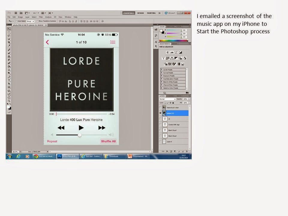
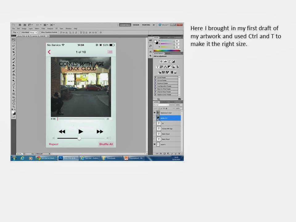
Promotion via iTunes

For the average music consumer, this is what they will see when listening to the song. I created this to create a visual image of what my product would look like in the perspective of a modern day consumer.


Sunday, 30 March 2014
Ancillary draft 2 photos
.JPG)
.JPG)
All these photos include a scenic mise-en-scene with an element of darkness which make them perfect to represent the mood of the song.
.JPG)
.JPG)
Reflection on ancillary text
The digipack in many ways was strong but in some cases it was weak.
The artwork was confusing as it had too much happening within the mise-en-scene. From this I have decided to take the more simplistic approach including a scenic mise-en-scene with some dark cloud to match the theme of the song.
Some examples:
 You Me At Six's 'Cavalier Youth' uses the mise-en-scene of a sunset. The use of the bright colours are used to represent the theme of the album as it is, in comparison the rest of their albums, happy.
The silhouette may suggest that the album is different to the rest of the other albums connoting a change in the band's career.
 The Neighbourhood's 'I Love You.' uses the mise-en-scene of dark clouds connoting to a dark album. It could also suggest that, since this is their debut album, the audience does not know what to expect.
The name of the album or band is not displayed on the album. You can only identity the name through the symbols used and the band's logo which represents the word 'You.' This could suggest that the band already has a big following meaning that this would be recogniseable from a fan's point of view.
.jpg) Arctic Monkey's 'Favourite Worst Nightmare' uses the photo of a British house with a dark sky. Again, this connotes a dark album or completely different album to the first.
Arctic Monkey's 'Favourite Worst Nightmare' uses the photo of a British house with a dark sky. Again, this connotes a dark album or completely different album to the first.
The inside of the house has bright colours connoting a don't-judge-a-book-by-its-cover vibe meaning the album may not be what the audience is expecting.
 The Blackout's 'Hope' uses a scenic mise-en-scene of a sea front with dark clouds. Like the others, this connotes a dark album or an album what the audience will not expect.
The use of the shooting star connotes a wish which fits the theme of the album name 'Hope' which could suggest the light at the end of the tunnel of a isolated time in life.
 Major Attack's 'Nostalgic Youth' uses a filter over the photo which gives the artwork a vintage vibe. This could connote an old-school theme which is a convention of the pop-punk genre which can be seen in Neck Deep's 'Growing Pains'
The artwork was confusing as it had too much happening within the mise-en-scene. From this I have decided to take the more simplistic approach including a scenic mise-en-scene with some dark cloud to match the theme of the song.
Some examples:
The silhouette may suggest that the album is different to the rest of the other albums connoting a change in the band's career.
The name of the album or band is not displayed on the album. You can only identity the name through the symbols used and the band's logo which represents the word 'You.' This could suggest that the band already has a big following meaning that this would be recogniseable from a fan's point of view.
The inside of the house has bright colours connoting a don't-judge-a-book-by-its-cover vibe meaning the album may not be what the audience is expecting.
The use of the shooting star connotes a wish which fits the theme of the album name 'Hope' which could suggest the light at the end of the tunnel of a isolated time in life.
Wednesday, 26 March 2014
Reflection on music video first draft
As my music video has many strong points, it still has things that need to change.
One thing that wasn't successful was the narrative; as we couldn't find actors free on the day(s) of filming we had to cut a whole scene of the narrative out. We have scheduled a new filming date with new actors who have confirmed to being available. Also, the acting within the narrative was weak; as the main actor was very inexperienced, he felt uncomfortable playing the role. At the time this didn't seem like a problem but during our next filming session we will spend more time to make sure the acting is exactly what we need.
Another thing that was discussed was the confusion of the role of the antagonist. It was hard to express the role of the antagonist but we have discussed to represent her through the use of a glow effect in terms of the editing.
For us, the performance is strong in comparison to the narrative. The mise-en-scene of a music venue can be easily seen and the cinematography of a hand held camera represented a live music performance well.
Thursday, 27 February 2014
Sunday, 23 February 2014
Shooting schedule w/ costume/props (23/2/14)
11am to 1pm (Wold Road)
Finished the narrative filming with actors Niall Foot.
4pm to 5pm (Rehersal rooms)
Reshot and finished the performance with Rob Pipes, Jack Coates and Jordan Mudd 


Subscribe to:
Posts (Atom)